How to Animate SVG Shapes on Scroll with GSAP
Scrolling can be so much fun! Let’s have a look at how to make SVG shapes and clip-paths animate on scroll to add a bit of drama and waviness to a design. We can morph one path into another and we’ll do that once a shape enters the viewport.
Let’s get started!
Path Animation on Separators
Animating a path on scroll can be particularly interesting for separators and borders to full screen images. So, let’s have a look at this first example, where we simply animate the path of an SVG that has the same fill color as the background of the page:

For this to work, we need two paths: one initial path that is a rectangle and a final path that is the wavy shape. When we create paths that will be animated, we have to keep in mind that all points present in the final path, also need to be there in the initial shape. So the best way to make sure our path animation doesn’t turn out funky, is to start crafting the most complex shape which in our case is the final path with the curve.
Creating the SVG paths
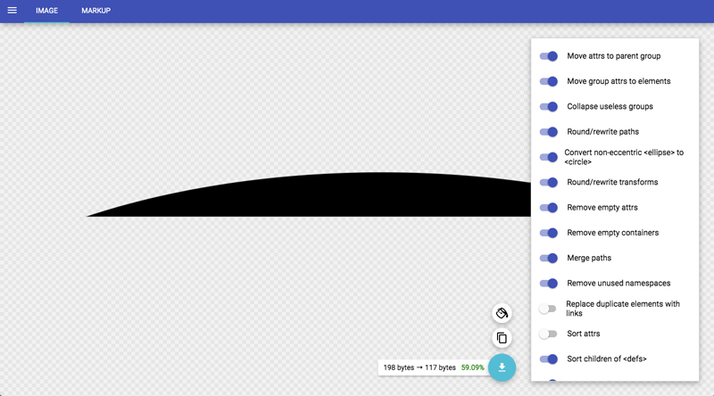
Unfortunately, graphic design softwares might not be the best choice for making proper, optimized paths. I usually start making the shapes in Sketch and then I optimize them using SVGOMG. Then, I copy the path and paste it into the SvgPathEditor. The optimization step is not always needed as the path editor offers rounding, which is great. I use it for paths or groups that had transforms applied to them by Sketch. SVGOMG can remove those.

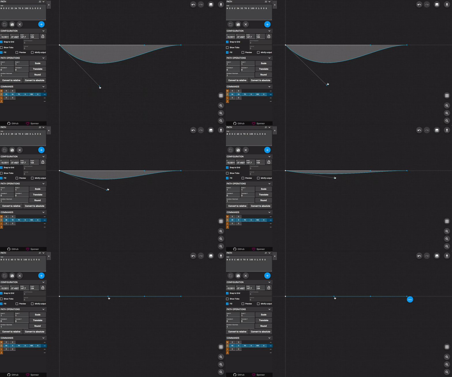
Once we have our optimized SVG with a “clean” path, we can use the editor to create the initial shape out of the more complex one:

When doing this, it’s as well a great way to roughly visualize how the animation will look and feel like (in reverse, of course). Once we have both paths, we can use them in our HTML.
Markup and Styling
<svg class="separator separator--up" width="100%" height="100%" viewBox="0 0 100 10" preserveAspectRatio="none">
	<path
		class="separator__path path-anim"
		d="M 0 0 C 40 0 60 0 100 0 L 0 0 Z"
		data-path-to="M 0 0 C 40 10 60 10 100 0 L 0 0 Z"
		vector-effect="non-scaling-stroke"
	/>
</svg>
Using a data-attribute, we define the final path that we want the initial one to animate to. A bit of CSS will make sure that our SVG is placed in full width, at the top of the large background image:
.separator {
	display: block;
	position: absolute;
	z-index: 1000;
	pointer-events: none;
	width: 100%;
	height: 150px;
	fill: var(--color-bg);
}
Note that you can stretch your SVG to your desired height, depending on how dramatic you want the wave to look when scrolling.
The JavaScript
For the smooth scrolling, we’ll use the new Lenis library by Studio Freight. GSAP’s ScrollTrigger plugin will allow us to animate an element when it enters or exits the viewport.
Let’s import the scripts that we need:
import Lenis from '@studio-freight/lenis'
import { gsap } from 'gsap';
import { preloader } from './preloader';
import { ScrollTrigger } from 'gsap/ScrollTrigger';
gsap.registerPlugin(ScrollTrigger);
Let’s preload the images:
preloader();Now we need all the path elements that we want animated (they have the class “path-anim”):
const paths = [...document.querySelectorAll('path.path-anim')];Next, we initialize smooth scrolling:
const lenis = new Lenis({
    lerp: 0.1,
    smooth: true,
});
const scrollFn = () => {
    lenis.raf();
    requestAnimationFrame(scrollFn);
};
requestAnimationFrame(scrollFn);
And finally, we animate our paths when they enter the viewport. The final path is defined in the data-attribute “data-path-to” in the path element, as we have seen previously.
The start and end is defined by the SVG’s element top reaching the bottom of the viewport, and its bottom reaching the top of the viewport:
paths.forEach(el => {
    const svgEl = el.closest('svg');
    const pathTo = el.dataset.pathTo;

    gsap.timeline({
        scrollTrigger: {
            trigger: svgEl,
            start: "top bottom",
            end: "bottom top",
            scrub: true
        }
    })
    .to(el, {
        ease: 'none',
        attr: { d: pathTo }
    });
});
Now, we have our morphing SVG paths while scrolling the page!
While we can use this animation technique on paths and “separators” that simply cover some big background image, we can also animate clip-paths on images, like in this example:
<svg class="image-clip" width="500px" height="750px" viewBox="0 0 500 750">
	<defs>
		<clipPath id="shape1">
			<path
				class="path-anim"
				d="M 0 0 L 500 0 C 500 599.6 500 677.1 500 750 L 0 750 C 0 205 0 105 0 0 Z"
				data-path-to="M 0 0 L 500 0 C 331 608 485 551 500 750 L 0 750 C 120 281 7 296 0 0 Z"
			/>
		</clipPath>
	</defs>
	<image
		clip-path="url(#shape1)"
		xlink:href="img/2.jpg"
		x="0" y="0"
		width="500"
		height="750"
	/>
</svg>
Final Result
Combining smooth scrolling with SVG path animations can add an extra level of morph-coolness to a design. It’s not very complicated but the result can look very dramatic. This technique gives an organic touch to a scroll experience and might spare the need to use WebGL for certain simple distortion effects.
I really hope you enjoyed this little tutorial and find it useful for creating your own animations!

 @todd
@todd