CSS Frameworks vs CSS – Whats your Best Option
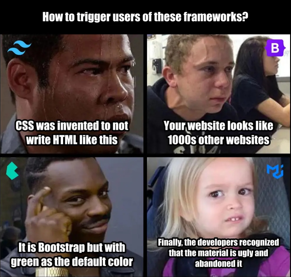
Hello guys and welcome to this article on the utility of CSS Frameworks against the normal CSS. Below is a viral meme which talks about these CSS Frameworks. Could be the truth or a lie depending on your perspective…

TAILWIND CSS vs CSS
Tailwind CSS is a CSS framework where you get to define your css styling as Html classNames. This is done within the HTML structure using pre defined tailwind css classes. The code below shows a basic HTML code with Tailwind css styling….
<div className="w-[95vw] sm:w-[85vw] md:w-[58vw]  h-auto items-center justify-center flex flex-wrap gap-2 scale-x-25 m:scale-100">
    <div className="w-[179px] h-[202px] sm:w-[229px] sm:h-[252px] md:w-[14rem] md:h-[17rem] rounded-xl relative transform -rotate-10 border-gray-500">
        <Image src={SpeakerImage1} alt="" className="w-full h-full rounded-xl object-cover" loading="lazy" />
    </div>
    <div className="w-[140px] h-[192px] sm:w-[190px] sm:h-[242px] md:w-[12rem] md:h-[19rem] rounded-xl relative transform rotate-10 left-[-2rem]">
        <Image src={SpeakerImage2} alt="" className="w-full h-full rounded-xl object-cover" loading="lazy"/>
    </div>
    <div className="w-[179px] h-[137px] sm:w-[229px] sm:h-[187px] md:w-[17rem] md:h-[12rem] rounded-xl relative top-[-5rem] m:top-[-10rem] transform rotate-9">
        <Image src={EventImage} alt="" className="w-full h-full rounded-xl object-cover" loading="lazy"/>
    </div>
</div>
The above creates an Image card with 3 images using predefined Tailwind css classes. Now let’s look at Bootstrap and see the Primary difference and what advantages these CSS Frameworks have over the normal css.
BOOTSTRAP CSS
Bootstrap CSS is also a css framework with predefined classes which you can put in your HTML code structure and style your HTML without writing a css styling code. Bootsra is mainly used for tables and all because though its much easier to use, it has a limited array of designs with almost no advanced features (please correct me if i’m wrong ). Below is the same code above Bootstrapped..
<div class="container">
  <div class="row justify-content-center align-items-center">
    <div class="col-12 col-sm-8 col-md-6 col-lg-4">
      <div class="card bg-light border-0">
        <img src={SpeakerImage1} alt="" class="card-img-top rounded-xl" loading="lazy" />
      </div>
    </div>
    <div class="col-12 col-sm-8 col-md-6 col-lg-4">
      <div class="card bg-light border-0">
        <img src={SpeakerImage2} alt="" class="card-img-top rounded-xl" loading="lazy" />
      </div>
    </div>
    <div class="col-12 col-sm-8 col-md-6 col-lg-4">
      <div class="card bg-light border-0">
        <img src={EventImage} alt="" class="card-img-top rounded-xl" loading="lazy" />
      </div>
    </div>
  </div>
</div>
You can try running the above codes to find out their results (be sure to change the images to your preferred images). In the meantime, let’s take a look at the basic differences between Bootstrap and Tailwind CSS which are the two major CSS Frameworks in existence.
- Bootstrap: Bootstrap follows a more opinionated and component-based approach. It provides a set of pre-designed components and styles that you can use out of the box. It also includes a grid system, JavaScript plugins, and other UI elements while Tailwind CSS takes a utility-first approach. Instead of providing pre-designed components, it gives you low-level utility classes that you can combine to build custom designs. It’s more like a set of building blocks that you can use to create your own styles.Bootstrap: Bootstrap follows a more opinionated and component-based approach. It provides a set of pre-designed components and styles that you can use out of the box. It also includes a grid system, JavaScript plugins, and other UI elements.while on the other hand, Tailwind CSS takes a utility-first approach. Instead of providing pre-designed components, it gives you low-level utility classes that you can combine to build custom designs. It’s more like a set of building blocks that you can use to create your own styles.Bootstrap: While Bootstrap allows for some level of customization, it may be more challenging to override default styles and achieve a highly customized look without significant effort. Tailwind CSS is highly customizable. You can create your own utility classes, define custom styles, and easily extend or modify the default configuration to fit your project’s design requirements.
And with the above, we can see that if we want a bit of freedom in styling our webpages but dont want to write all custom classes from scratch, we can make use of Tailwind CSS’s flexibility to customise our design as much as possible. Do remember that Bootstrap is quite rigid and unconventionally hard to customise but its not impossible, so if you think that yes, you can get it done, do you..
Like the above meme sys, CSS was invented so that HTML wouldn’t be written like this as it looks a bit too messy and disorganised but overall, it all depends on your projects requirements as they would determine what technology you would use.
PS:
Tailwind CSS is mostly used for NEXTjs and TYPESCRIPT Projects.

