Menu
Community /Pin to ProfileBookmark
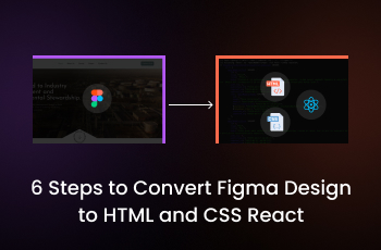
6 Steps to Convert Figma Design to HTML and CSS React

Figma stands as a powerful ally, enabling designers to craft stunning and intricate UI elements. But these designs, like vibrant butterflies awaiting flight, long to break free from the canvas and take form as interactive web pages. Here, we’ll explore the magical process to convert Figma to HTML, CSS, and React components, ready to engage users and captivate audiences.
Key Steps for Conversion: A Journey of Code and Creativity
Preparing Your Figma Design
- Organization is Key: Structure your design with clear layers and naming conventions for effortless translation into code.
- Consistency Matters: Maintain consistent spacing, font sizes, and colors throughout your design for a cohesive look and feel.
- Consider responsiveness: design with different screen sizes in mind to ensure a seamless experience across devices.
- Before diving into code, take a close look at your Figma design. Identify key components, such as headers, footers, navigation bars, and content sections. This understanding will serve as a roadmap for structuring your HTML and CSS in React.
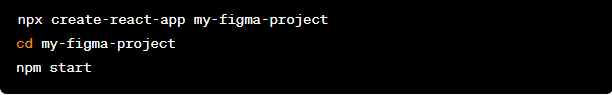
Set Up Your React Environment
Ensure you have Node.js and npm installed on your machine. Create a new React project using create-react-app or your preferred method. This sets up the foundation for building a React application.
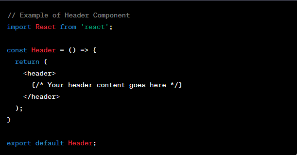
Break Down the Design into Components
Divide your Figma design into smaller, manageable components. Each major section (header, footer, etc.) and every reusable element (buttons, cards, etc.) should become a React component. This modular approach enhances code organization and maintainability.
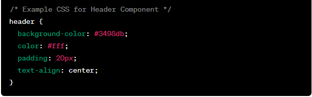
Convert Figma Styles to CSS
Examine the styles in your Figma design and translate them into CSS. Utilize class names and adhere to a consistent naming convention for better scalability. Leverage CSS features such as Flexbox or Grid to achieve the desired layout.
Choosing Your Conversion Method
- Manual Conversion: Gain full control over the code by handcrafting it yourself.
- Third-Party Plugins: Streamline the process with tools like:
- Anima: Offers flexibility and customization options.
- TeleportHQ: Generates clean and well-structured code.
- Plasmic: specializes in creating reusable components.
- Builder.io: integrates design and content management.
Exporting Essential Assets
- Gather Images: Export any accompanying images or icons for inclusion in your project.
- Extract Fonts: Ensure consistent typography by downloading necessary fonts.
Converting to HTML and CSS
- Structure with HTML: Define the content structure using elements like header, nav, main, section, and footer.
- Style with CSS: Apply visual styling for elements, typography, spacing, and layout.
- Address responsiveness: Use media queries to adapt your design to different screen sizes.
Integrating with React
- Break into Components: Decompose your design into reusable React components.
- Import Code: Bring the HTML and CSS into your React project, adjusting the syntax as needed.
- Add State and Logic: Incorporate interactivity and functionality with React’s state and lifecycle methods.
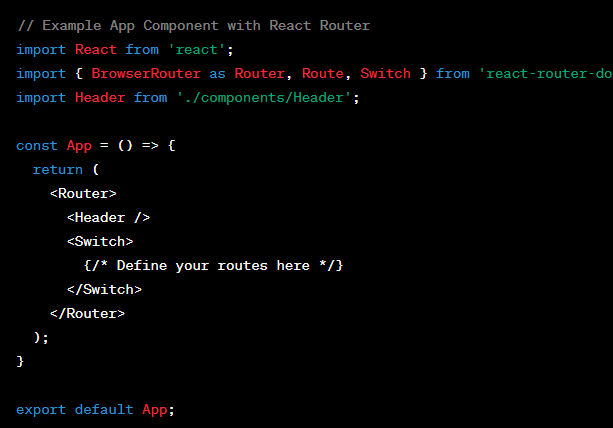
Leverage React Router for Navigation
Implement React Router to create a seamless navigation experience. Define routes for different pages and link them appropriately.
Testing and refinement
- Scrutinize Thoroughly: Test across browsers and devices to ensure compatibility and responsiveness.
- Refine as Needed: Address any inconsistencies or visual discrepancies between the design and implementation.
SEO Optimization for Visibility and Success
- Semantic HTML: Utilize meaningful tags to communicate content structure to search engines.
- Descriptive Titles and Meta Tags: Craft compelling titles and meta descriptions that accurately represent your content.
- Optimized Images: Use descriptive filenames, alt text, and appropriate file sizes.
- Structured Data: Employ schema markup to enhance search result snippets and visibility.
- Mobile-Friendliness: Prioritize responsive design for optimal user experience across devices.
Additional Tips for Success
- Collaboration is key: Foster communication between designers and developers throughout the process.
- Component-Based Approach: Think in terms of reusable components for efficient development and maintenance.
- Accessibility Matters: Design with inclusivity in mind, ensuring content is accessible to all users.
- Stay Updated: Keep abreast of the latest Figma features and React best practices to optimize your workflow.
Conclusion
By following these steps, you can seamlessly convert your Figma designs into a React application with SEO-friendly HTML and CSS. This approach not only enhances the user experience but also contributes to improved search engine rankings, ensuring your website reaches a broader audience. Happy coding!
Sign in
to post a comment