Menu
Bounties /Pin to ProfileBookmark
Problem with navigator (FlexBox and Grid-area)
I want to place a navigator list vertical from horizontal.
How do I do that:?
HTML file
<!DOCTYPE html>
<html lang="zxx">

<head>
 <meta charset="UTF-8">
 <meta name="description" content="Checkpoint 3">
 <meta name="author" content="Tiet Hoc Co">
 <link rel="stylesheet" href="css/style.css">
 <title>Tiet, Hoc Co</title>
</head>
 <body>
 <div class="wrapper">
 <header>
 <img src="images/logo.jpg" alt="logga" title="Vår logotype">
 <div>
 <nav>
 <ul>
 <li><a href="#">Hem</a></li>
 <li><a href="#">Turist</a></li>
 <li><a href="#">Bilder</a></li>
 <li><a href="#">Om</a></li>
 </ul>
 </nav>
 </div>
 </header>


 <main>
 <header class="back">
 <h1>Tiet, Hoc Co</h1>
 </header>

 <div class="gallery">
 <header class="bild01">
 <img src="images/plommon.jpg" alt="Gallery image 1" class="gallery__img">
 </header>
 <header class="bild05">
 <h2>Section 1: Rubrik 1</h2>
 </header>
 <header class="bild09">
 <p>At vero eos et accusamus et iusto odio dignissimos ducimus qui blanditiis praesentium voluptatum deleniti atque corrupti quos dolores et quas molestias excepturi sint occaecati cupiditate non</p>
 </header>
 <header class="bild13">
 <p>At vero eos et accusamus et iusto odio dignissimos ducimus qui blanditiis praesentium voluptatum deleniti atque corrupti quos dolores et quas molestias excepturi sint occaecati cupiditate non</p>
 </header>
 <header class="bild17">
 <p>At vero eos et accusamus et iusto odio dignissimos ducimus qui blanditiis praesentium voluptatum deleniti atque corrupti quos dolores et quas molestias excepturi sint occaecati cupiditate non</p>
 </header>
 <header class="bild02">
 <img src="images/plommon.jpg" alt="Gallery image 1" class="gallery__img">
 </header>
 <header class="bild06">
 <h2>Section 2: Rubrik 2</h2>
 </header>
 <header class="bild10">
 <p>At vero eos et accusamus et iusto odio dignissimos ducimus qui blanditiis praesentium voluptatum deleniti atque corrupti quos dolores et quas molestias excepturi sint occaecati cupiditate non</p>
 </header>
 <header class="bild14">
 <p>At vero eos et accusamus et iusto odio dignissimos ducimus qui blanditiis praesentium voluptatum deleniti atque corrupti quos dolores et quas molestias excepturi sint occaecati cupiditate non</p>
 </header>
 <header class="bild18">
 <p>At vero eos et accusamus et iusto odio dignissimos ducimus qui blanditiis praesentium voluptatum deleniti atque corrupti quos dolores et quas molestias excepturi sint occaecati cupiditate non</p>
 </header>
 <header class="bild03">
 <img src="images/plommon.jpg" alt="Gallery image 1" class="gallery__img">
 </header>
 <header class="bild07">
 <h2>Section 3: Rubrik 3</h2>
 </header>
 <header class="bild11">
 <p>At vero eos et accusamus et iusto odio dignissimos ducimus qui blanditiis praesentium voluptatum deleniti atque corrupti quos dolores et quas molestias excepturi sint occaecati cupiditate non</p>
 </header>
 <header class="bild15">
 <p>At vero eos et accusamus et iusto odio dignissimos ducimus qui blanditiis praesentium voluptatum deleniti atque corrupti quos dolores et quas molestias excepturi sint occaecati cupiditate non</p>
 </header>
 <header class="bild19">
 <p>At vero eos et accusamus et iusto odio dignissimos ducimus qui blanditiis praesentium voluptatum deleniti atque corrupti quos dolores et quas molestias excepturi sint occaecati cupiditate non</p>
 </header>
 <header class="bild04">
 <img src="images/plommon.jpg" alt="Gallery image 1" class="gallery__img">
 </header>
 <header class="bild08">
 <h2>Section 4: Rubrik 4</h2>
 </header>
 <header class="bild12">
 <p>At vero eos et accusamus et iusto odio dignissimos ducimus qui blanditiis praesentium voluptatum deleniti atque corrupti quos dolores et quas molestias excepturi sint occaecati cupiditate non</p>
 </header>
 <header class="bild16">
 <p>At vero eos et accusamus et iusto odio dignissimos ducimus qui blanditiis praesentium voluptatum deleniti atque corrupti quos dolores et quas molestias excepturi sint occaecati cupiditate non</p>
 </header>
 <header class="bild20">
 <p>At vero eos et accusamus et iusto odio dignissimos ducimus qui blanditiis praesentium voluptatum deleniti atque corrupti quos dolores et quas molestias excepturi sint occaecati cupiditate non</p>
 </header>
 </div>
 </main>

 <footer>
 <div class="slut">
 <header class="fot">
 <h3>Adress</h3>
 <p>Adam akvarium</p>
 <p>Fiskvägen 1</p>
 <p>123 45 Fiskstad</p>
 </header>
 <header class="nav2">

 <nav>
 <ul>
 <li><a href="#">Hem</a></li>
 <li><a href="#">Turist</a></li>
 <li><a href="#">Bilder</a></li>
 <li><a href="#">Om</a></li>
 </ul>
 </nav>
 </header>
 <header class="citat">
 <h3>Citat</h3>
 <p>Footer: At vero eos et accusamus et iusto</p>
 </header>
 <p>Footer: At vero eos et accusamus et iusto</p>
 </div>
 </footer>
 </div>
 </body>
</html>
CSS file
@import url('https://fonts.googleapis.com/css2?family=Open+Sans:wght@300&display=swap');
@font-face {
 font-family: Raleway;
 src: url('../fonts/raleway.woff') format('woff'),
 url('../fonts/raleway.woff2') format('woff2');
}

header {
 background-color: white;
 display: flex;

 justify-content: space-between;
}

.wrapper {
 width: 1300px;
}

header img {
 height: 80px;
 width: 150px;
}

nav li {

 background-color: cyan;
 padding: 10px;
 display: inline-block;

}


header.back{
 height: 600px;
 background-image: url("../images/beach.jpg");
 background-size: cover;
 background-position: center;
 display: flex;
 justify-content: center;
 align-items: center;

}

nav ul {
 display: flex;
 align-items: center;
 justify-content: center;
 gap: 0 20px;
 background-color: aqua;
 padding: 10px;
}

/* mouse over link */
a:hover {
 color: hotpink;
 background-color: black;
}


.container {
 width: 100%;
 margin: 2rem auto;
 }

img[alt="Gallery image 1"] {
 width: 200px;
 height: 200px;
 border-radius: 100%;
}


 .gallery {
 padding-top: 50px;
 display: grid;
 /*justify-content:space-between;*/
 column-gap: 2rem;
 grid-template-columns: 200px 200px 200px 200px;
 grid-template-rows: 200px 50px 160px 160px 160px;
 grid-template-areas:
 "a01 a02 a03 a04"
 "a05 a06 a07 a08"
 "a09 a10 a11 a12"
 "a13 a14 a15 a16"
 "a17 a18 a19 a20";
 }

 header.bild01 {
 grid-area: a01;
 }

 header.bild05 {
 background-color: hsl(165, 60%, 80%);
 grid-area: a05;
 }

 header.bild09 {
 background-color: hsl(165, 60%, 80%);
 font-weight: bold;
 grid-area: a09;
 }

 header.bild13 {
 background-color: hsl(165, 60%, 80%);
 grid-area: a13;
 }

 header.bild17 {
 background-color: hsl(165, 60%, 80%);
 grid-area: a17;
 }

 header.bild02 {
 grid-area: a02;
 }

 header.bild06 {
 background-color: hsl(165, 60%, 80%);
 grid-area: a06;
 }

 header.bild10 {
 background-color: hsl(165, 60%, 80%);
 font-weight: bold;
 grid-area: a10;
 }

 header.bild14 {
 background-color: hsl(165, 60%, 80%);
 grid-area: a14;
 }

 header.bild18 {
 grid-area: a18;
 background-color: hsl(165, 60%, 80%);
 }

 header.bild03 {
 grid-area: a03;
 }

 header.bild07 {
 background-color: hsl(165, 60%, 80%);
 grid-area: a07;
 }

 header.bild11 {
 background-color: hsl(165, 60%, 80%);
 font-weight: bold;
 grid-area: a11;
 }

 header.bild15 {
 background-color: hsl(165, 60%, 80%);
 grid-area: a15;
 }

 header.bild19 {
 background-color: hsl(165, 60%, 80%);
 grid-area: a19;
 }

 header.bild04 {
 grid-area: a04;
 }

 header.bild08 {
 background-color: hsl(165, 60%, 80%);
 grid-area: a08;
 }

 header.bild12 {
 background-color: hsl(165, 60%, 80%);
 font-weight: bold;
 grid-area: a12;
 }

 header.bild16 {
 background-color: hsl(165, 60%, 80%);
 grid-area: a16;
 }

 header.bild20 {
 background-color: hsl(165, 60%, 80%);
 grid-area: a20;
 }

 .slut {
 display: grid;
 grid-template-columns: 300px 300px 300px;
 grid-template-rows: 150px 100px;
 grid-template-areas:
 "b01 b02 b03"
 "b04 b05 b06";
 }

 header.fot {
 display: inline-block;
 padding-top: 0rem;
 padding-bottom: 0rem;
 grid-area: b01;
 }

 header.nav2 {
 background-color: cyan;
 grid-area: b02;
 display: inline;

 }

 header.nav2 ul {
 display:flex;
 grid-area: b06;
 }

 header.citat {
 grid-area: b03;
 display: inline-block;
 }
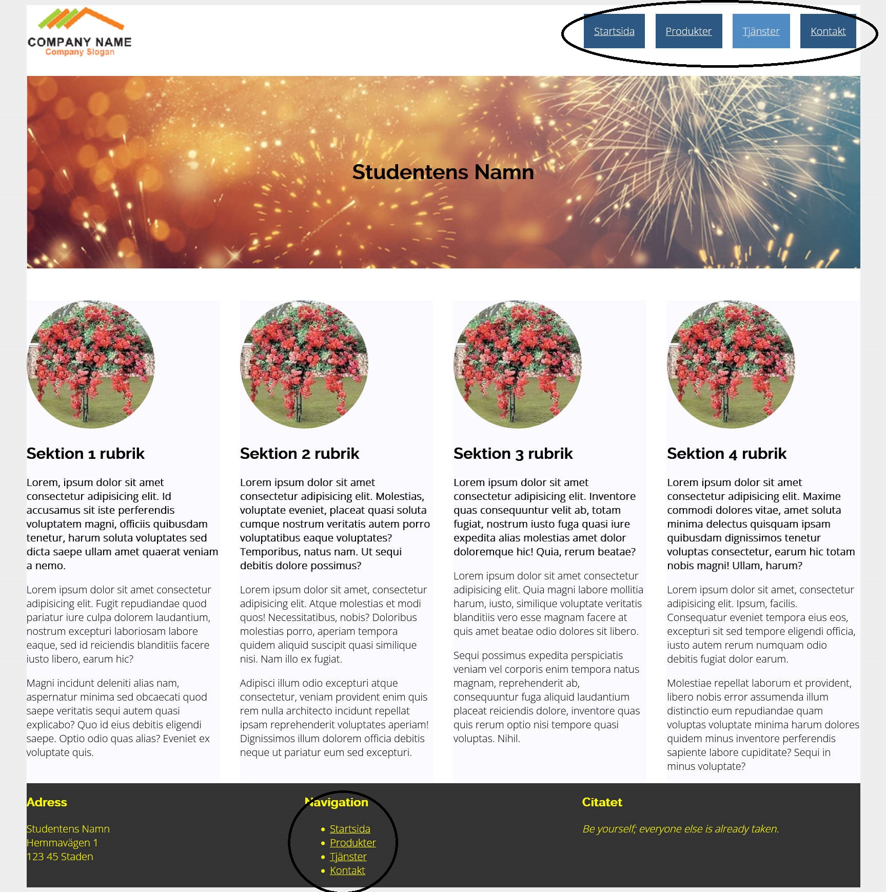
I have 2 problems:
1. In the upper corner I want space between the navigator selections. How to do? I MUST use FlexBox design.
2. In the botton I want the navigator nav2 placed ion vertical position. How to do this? Here I MUST use Grid-Area concept.
I wan to look like this. See the marked area in the picture.
Sign in
to post a answer