Menu
Articles /Pin to ProfileBookmark
Tutorial: How to build a tiered price component in HTML & CSS
A few weeks ago tiiny.host (a simple way to share your web project) launched a deal but presented it in a creative way.
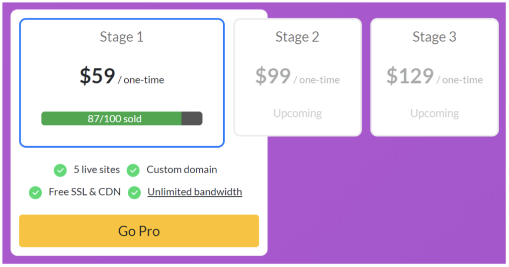
A few asked how it was made so I wanted to break it down for others.
The original was created with react & bootstrap so I re-created it in pure HTML & CSS to breakdown it’s components. Feel free to use the component yourself if you like it 🙂
—
The container is a simple, rounded rectangle with a white background featuring two child divs:
<div class="container">
<div class="price-tiers-container">
<!-- Prices tiers go here -->
</div>
<div class="features-container">
<!-- Prices tiers go here -->
</div>
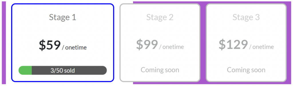
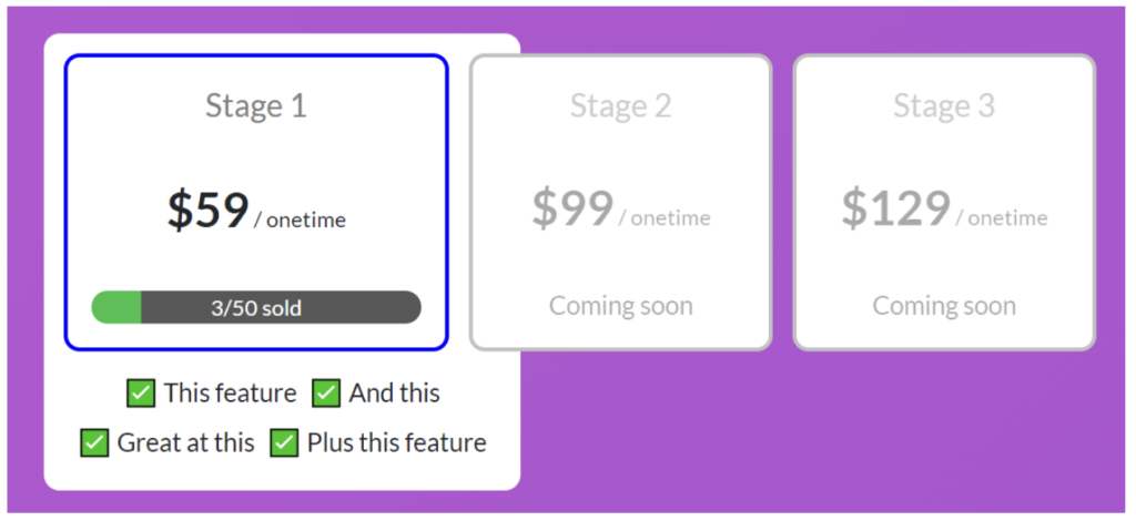
</div>Let’s look at the price tiers first. These contained three further divs wrapped by the price-tiers-container class.
In order to make the divs extend out of it’s parent container class we needed to apply the position: absolute for price-tiers-container. We also ensured it had a fixed width and used a flex layout to divide the space amongst the three price tiers.
The final class looked like this:
.price-tiers-container {
    display: flex;
    position: absolute;
    width: 530px;
}
Within this we have three price-tier divs with these styles:
.price-tier {
flex: 3;
display: flex;
flex-direction: column;
justify-content: space-between;
background: white;
border: solid 2px #c1c1c1;
border-radius: 8px;
margin-top: 10px;
margin-left: 10px;
padding: 12px;
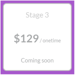
}Each price-tier is given a default equal width by setting flex of 3 (but the active one is flex: 4). We also use flex to align items within the price-tier div and space the items evenly using justify-content: space-between. Finally we apply some individual border, padding etc styles.
Within each price tier we just have three divs:
.title {
    color: grey;
}

.price {
    font-size: 1.5rem;
}

.price-period {
    font-size: 0.7rem;
}

.label {
    font-size: 0.8rem;
}

<div class="price-tier">

  <div class="title">

    Stage 2

  </div>

  <div class="price">

    <b>$99</b><span class="price-period"> / onetime</span>

  </div>

  <div class="label">Coming soon</div>

</div>
With the active price tier, the set up is slightly different:
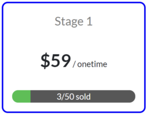
.active {border-color: blue;flex: 4 !important;height: 150px;}<div class="price-tier active"><div class="p-title">Stage 1</div><div class="price"><b>$59</b><span class="price-period"> / onetime</span></div><div class="progress-bar">3/50 sold</div></div>
The active price-tier swaps out the label for a progress-bar and applies the active class as well. To make it more prominent we assign it a fixed height, override the default border-color and increase the flex to 4.
Additionally, we grey out the content in the non-active price-tiers like so:
.price-tier > div {opacity: 0.4;}.active > div {opacity: 1;}
Finally in order to make the progress bar in the active price tier we use a css-gradient trick:
.p-progress-bar {background: linear-gradient(90deg, #2BC147 0%, #2BC147 15%, #575757 15%, #575757 100%);color: white;border-radius: 8px;width: 100%;font-size: 0.7rem;}
We set the background to 90 degree but set the green (#2BC147) at 0% and 15% and the the grey (#575757) at 15% and 100%. This gives the illusion of a progress bar. If we need to increase the progress then we just modify 15% to the new progress level.
Finally, we complete the features-container:
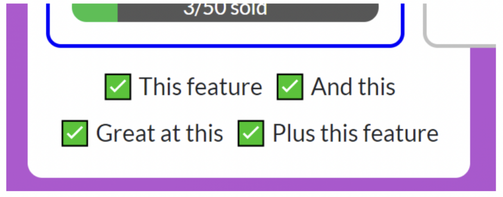
.features-container {display: flex;flex-wrap: wrap;justify-content: center;padding: 168px 12px 12px 12px;align-content: space-evenly;}.feature::before {content: '✅ ';}.feature {margin: 3px;font-size: 0.8rem;}<div class="features-container"><div class="feature">This feature</div><div class="feature">And this</div><div class="feature">Great at this</div><div class="feature">Plus this feature</div></div>
Here, we use a flex layout again and set align-content: space-evenly to evenly space the list of features within the container.
We apply large top padding of 168px to leave space for the pricing-tier-container. This is because it has position: absolute meaning it takes no space in parent div. In order for it to not overlap we reserve artificial space for it.
We apply a ::before selector to each feature and set the content to a tick emoji (you can use anything) to add ticks to each item.
And that’s it! Hope that was helpful, let me know if you have any questions in the comments.
Full HTML & CSS CodePen:
See the Pen
Lifetime deal component by RabbitsFoot8 (@rabbitsfoot8)
on CodePen.0
follow
0 Following • 3 Followers
About @tiinyhost
Tiiny Host
The simplest way to host & share your web project.
